Forfatter av avsnitt: Danielle J. Navarro and David R. Foxcroft
Sjekk forutsetningen om normalfordeling for en stikkprøve
All of the tests that we have discussed so far in this chapter have assumed that the data are normally distributed. This assumption is often quite reasonable, because the central limit theorem does tend to ensure that many real-world quantities are normally distributed. Any time that you suspect that your variable is actually an average of lots of different things, there is a pretty good chance that it will be normally distributed, or at least close enough to normal that you can get away with using t-tests. However, life does not come with guarantees, and besides there are lots of ways in which you can end up with variables that are highly non-normal. For example, any time you think that your variable is actually the minimum of lots of different things, there is a very good chance it will end up quite skewed. In psychology, response time (RT) data is a good example of this. If you suppose that there are lots of things that could trigger a response from a human participant, then the actual response will occur the first time one of these trigger events occurs.[1] This means that RT data are systematically non-normal. Okay, so if normality is assumed by all the tests, and is mostly but not always satisfied (at least approximately) by real-world data, how can we check the normality of a sample? In this section I discuss two methods: QQ plots and the Shapiro-Wilk test.
QQ-plott
One way to check whether a sample violates the normality assumption is to draw a “QQ plot” (Quantile-Quantile plot). This allows you to visually check whether you are seeing any systematic violations. In a QQ plot, each observation is plotted as a single dot. The x co-ordinate is the theoretical quantile that the observation should fall in if the data were normally distributed (with mean and variance estimated from the sample), and on the y co-ordinate is the actual quantile of the data within the sample. If the data are normal, the dots should form a straight line. For instance, lets see what happens if we generate data by sampling from a normal distribution, and then drawing a QQ plot. The results are shown in Fig. 117.
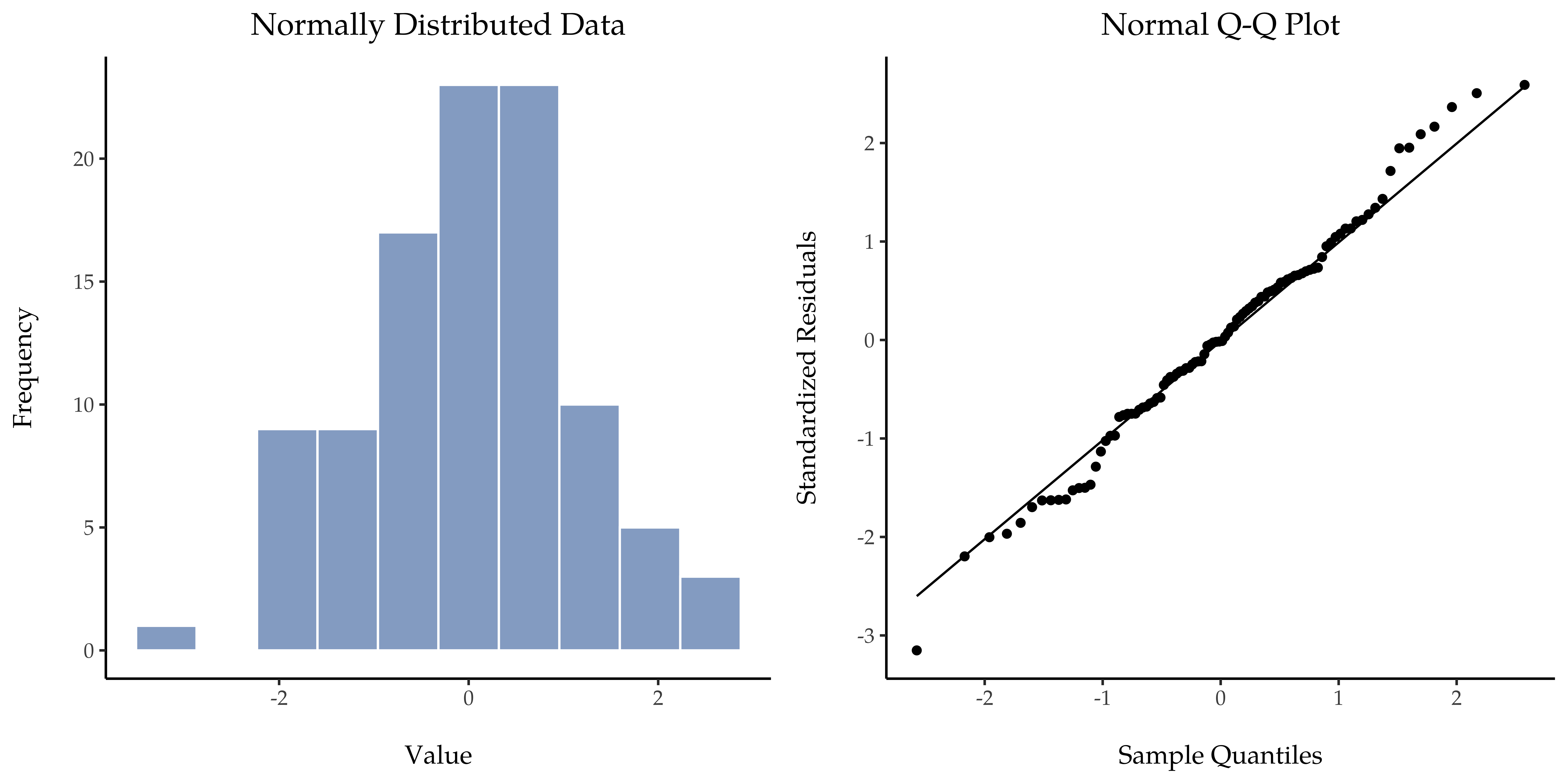
Fig. 116 Histogram (venstre panel) og QQ-plott (høyre panel) for kolonnen Normal i datasettet distributions, et normalfordelt utvalg med 200 observasjoner. Shapiro-Wilk-statistikken knyttet til disse dataene er W = 0,992, noe som indikerer at det ikke ble oppdaget noen signifikante avvik fra normalfordeling (p = 0,361).
As you can see, these data form a pretty straight line; which is no surprise given that we sampled them from a normal distribution! In contrast, have a look at the two data sets shown in Fig. 117. The top panels show the histogram and a QQ plot for a data set that is highly skewed: the QQ plot curves upwards. The lower panels show the same plots for a heavy tailed (i.e., high kurtosis) data set: in this case the QQ plot flattens in the middle and curves sharply at either end.
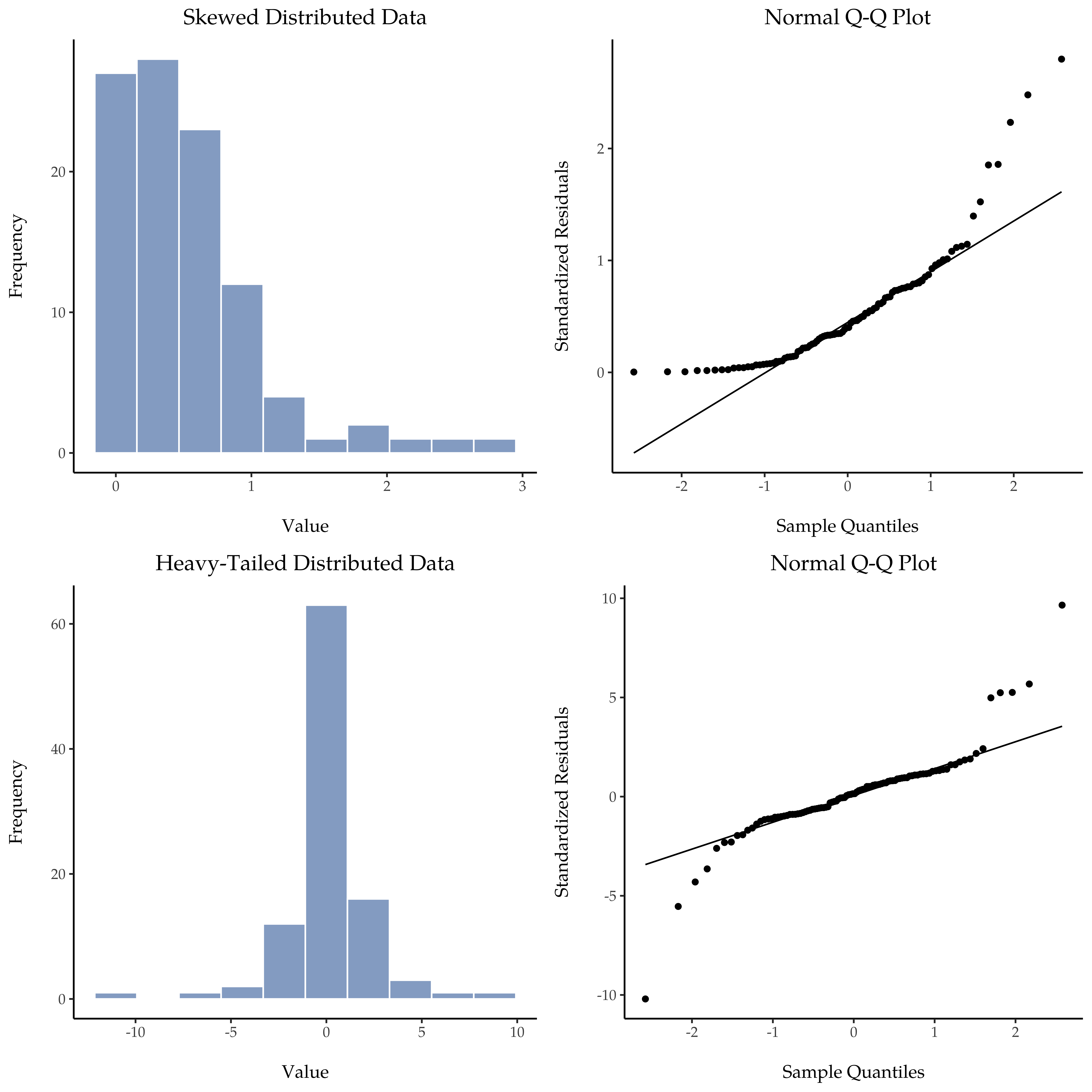
Fig. 117 Øverste rad viser et histogram (øverst til venstre) og et QQ-plott (øverst til høyre) for 200 observasjoner i kolonnen Skewed i datasettet distributions. Skjevheten i dataene her er 1,543, noe som gjenspeiles i et QQ-plott som buer oppover og mangler de lavere verdiene i Standardized Residuals. Som en konsekvens av dette er Shapiro-Wilk-statistikken W = 0,732, noe som gjenspeiler et signifikant avvik fra normalfordelingen (p < 0,001). Den nederste raden viser de samme plottene for de 200 observasjonene i kolonnen Heavy Tailed i datasettet distributions. I dette tilfellet gir de tunge halene i dataene en høy kurtosis (8,225), noe som fører til at QQ-plottet flater ut i midten og bøyer kraftig av på hver side. Den resulterende Shapiro-Wilk-statistikken er W = 0,765, noe som igjen gjenspeiler et signifikant avvik fra normalfordelingen (p < 0,001).
Shapiro-Wilk-tester
QQ plots provide a nice way to informally check the normality of your data, but sometimes you will want to do something a bit more formal and the Shapiro-Wilk test (Shapiro & Wilk, 1965) is probably what you are looking for.[2] As you would expect, the null hypothesis being tested is that a set of N observations is normally distributed.[3]
Because it is a little hard to explain the maths behind the W statistic, a better idea is to give a general description of how it behaves. Small values of W indicate departure from normality. The W statistic has a maximum value of 1, which occurs when the data look “perfectly normal”. The smaller the value of W the less normal the data are. However, the sampling distribution for W, which is not one of the standard ones that I discussed in chapter Introduksjon til sannsynlighetsregning, does depend on the sample size N. To give you a feel for what these sampling distributions look like, I have plotted three of them in Fig. 118. Notice that, as the sample size starts to get large, the sampling distribution becomes very tightly clumped up near W = 1, and as a consequence, for larger samples W does not have to be very much smaller than 1 in order for the test to be significant.
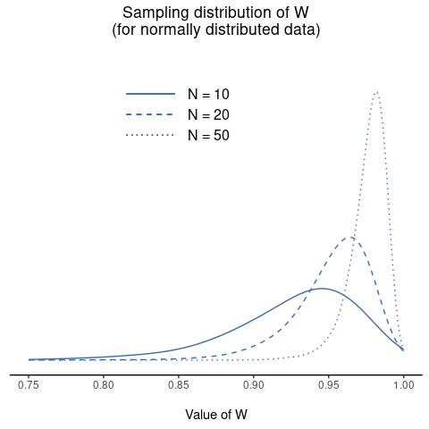
Fig. 118 Utvalgsfordeling av Shapiro-Wilk W-statistikken, under nullhypotesen om at dataene er normalfordelte, for utvalg av størrelse 10, 20 og 50. Merk at små verdier av W indikerer avvik fra normalfordelingen.
To get the Shapiro-Wilk statistic in jamovi t-tests, check the option for
Normality listed under Assumptions. In the randomly sampled data
(N = 100) we used for the QQ plot, the value for the Shapiro-Wilk normality
test statistic was W = 0.99 with a p-value of 0.54. So, not surprisingly, we
have no evidence that these data depart from normality. When reporting the
results for a Shapiro-Wilk test, you should (as usual) make sure to include the
test statistic W and the p-value, though given that the sampling
distribution depends so heavily on N it would probably be a politeness to
include N as well.
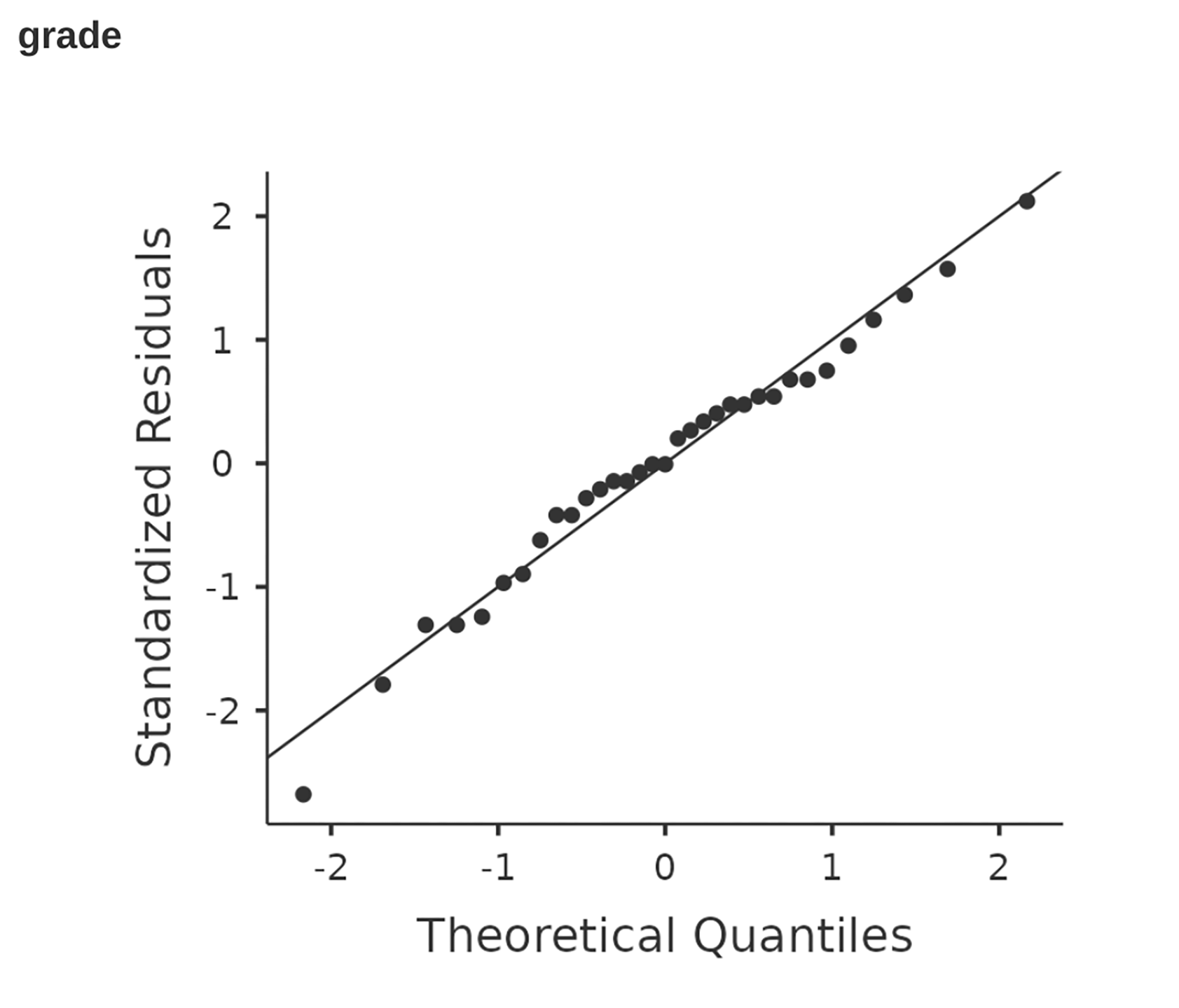
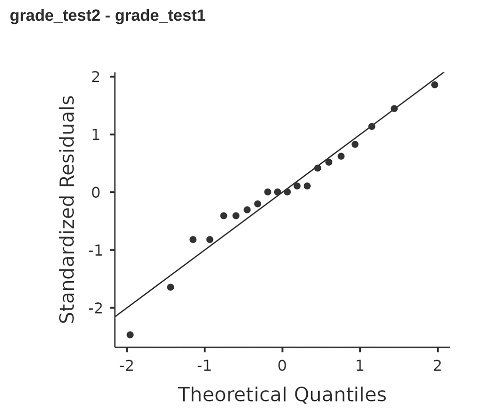
Fig. 119 jamovi QQ plot for the independent t-test in Fig. 106
Eksempel
In the meantime, it is probably worth showing you an example of what happens to
the QQ plot and the Shapiro-Wilk test when the data turn out to be non-normal.
For that, let us look at the distribution of our AFL winning margins variable
(afl.margins from the aflsmall_margins data set), which if you remember
back to th chapter on Deskriptivstatistikk did not look like they
came from a normal distribution at all. Here is what happens to the QQ plot:
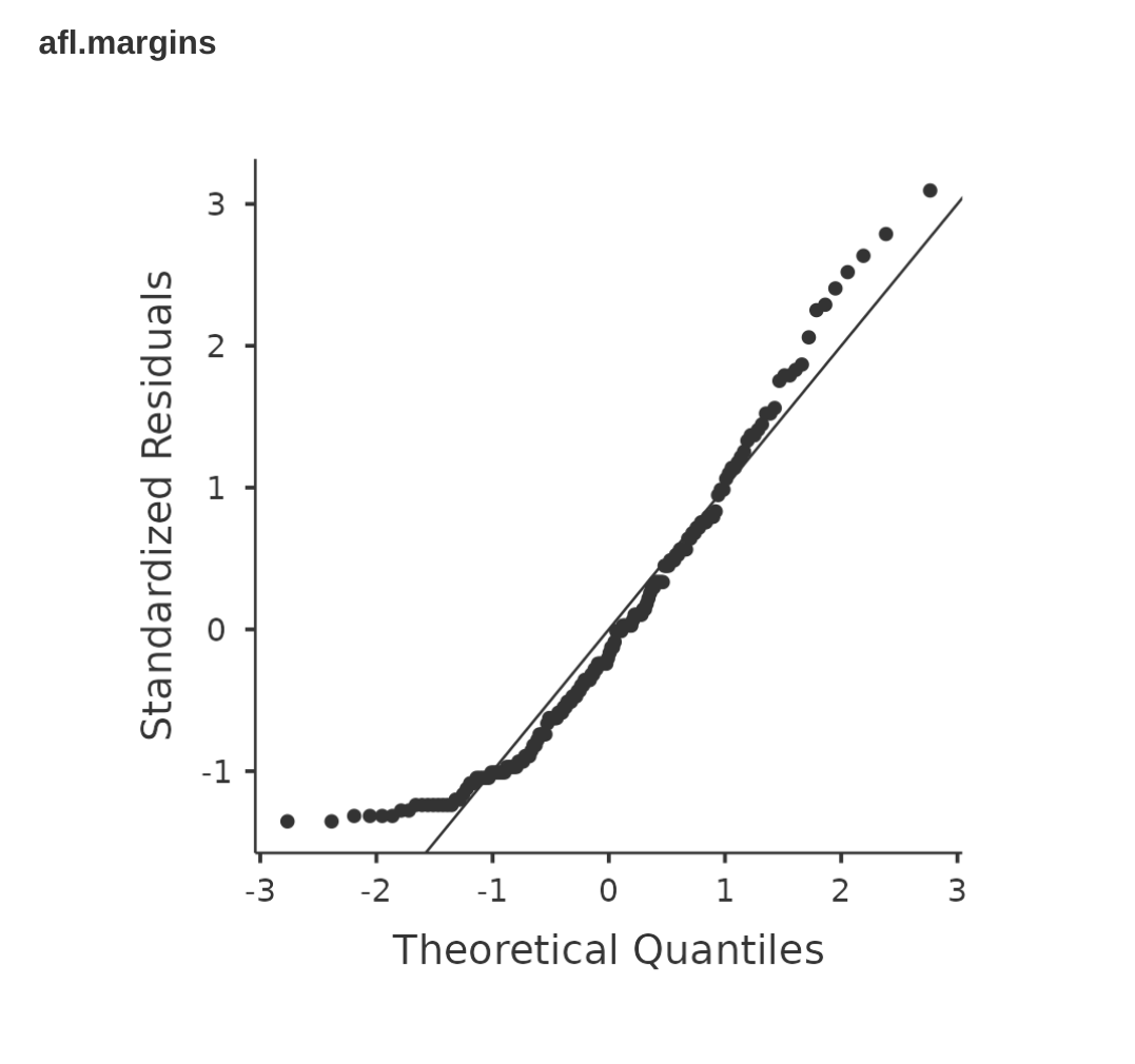
Fig. 121 jamovi QQ plot for the (skewed) data in the afl.margins variable of the
aflsmall_margins data set
And when we run the Shapiro-Wilk test with the afl.margins variable, we get
a value for the Shapiro-Wilk normality test statistic of W = 0.94, and
p-value = 9.481e-07. Clearly a significant effect!