Section author: Danielle J. Navarro and David R. Foxcroft
Box plots
Another alternative to histograms is a box plot, sometimes called a
“box and whiskers” plot. Like histograms they’re most suited to interval
or ratio scale data. The idea behind a box plot is to provide a simple
visual depiction of the median, the interquartile range, and the range
of the data. And because they do so in a fairly compact way box plots
have become a very popular statistical graphic, especially during the
exploratory stage of data analysis when you’re trying to understand the
data yourself. Let’s have a look at how they work, again using the
afl.margins variable from the aflsmall_margins data set as our example.
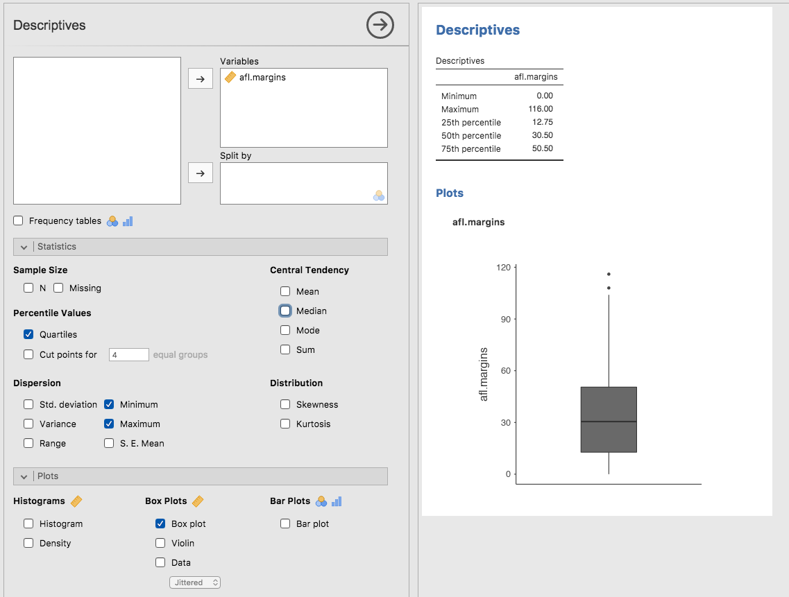
Fig. 23 Box plot of the afl.margins variable from the aflsmall_margins data
set plotted in jamovi
The easiest way to describe what a box plot looks like is just to draw one.
Click on the Box plot check box and you will get the plot shown on the
lower right of Fig. 23. jamovi has drawn the most basic box plot
possible. When you look at this plot this is how you should interpret it: the
thick line in the middle of the box is the median; the box itself spans the
range from the 25th percentile to the 75th percentile; and the “whiskers” go
out to the most extreme data point that doesn’t exceed a certain bound. By
default, this value is 1.5 times the interquartile range (IQR), calculated as
25th percentile - (1.5 * IQR) for the lower boundary, and 75th percentile
+ (1.5 * IQR) for the upper boundary. Any observation whose value falls
outside this range is plotted as a circle or dot instead of being covered by
the whiskers, and is commonly referred to as an outlier. For the
afl.margins variable there are two observations that fall outside this
range, and these observations are plotted as dots (the upper boundary is 107,
and looking over the data column in the spreadsheet there are two observations
with values higher than this, 108 and 116, so these are the dots).
Violin plots
A variation to the traditional box plot is the violin plot. Violin plots are
similar to box plots except that they also show the kernel probability density
of the data at different values. Typically, violin plots will include a marker
for the median of the data and a box indicating the interquartile range, as in
standard box plots. In jamovi you can achieve this sort of functionality by
checking both the Violin and the Box plot check boxes. See
Fig. 24, which also has the Data check box turned on to show
the actual data points on the plot. This does tend to make the graph a bit too
busy though, in my opinion. Clarity is simplicity, so in practice it might be
better to just use a simple box plot.

Fig. 24 Violin plot of the afl.margins variable from the aflsmall_margins
file plotted in jamovi, alsow showing a box plot and data points
Drawing multiple box plots
One last thing. What if you want to draw multiple box plots at once? Suppose,
for instance, I wanted separate box plots showing the AFL margins not just for
2010 but for every year between 1987 and 2010. To do that the first thing we’ll
have to do is find the data. These are stored in the aflmarginbyyear data
set. So let’s load it into jamovi and see what is in it. You will see that it is
a pretty big data set. It contains 4296 games and the variables that we’re
interested in. What we want to do is have jamovi draw box plots for the
margin variable, but plotted separately for each year. The way to do
this is to move the year variable across into the Split by box, as in
Fig. 25.
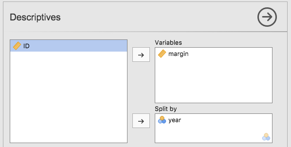
Fig. 25 jamovi screen shot showing the Split by box
The result is shown in Fig. 26. This version of the box plot, split by year, gives a sense of why it’s sometimes useful to choose box plots instead of histograms. It’s possible to get a good sense of what the data look like from year to year without getting overwhelmed with too much detail. Now imagine what would have happened if I’d tried to cram 24 histograms into this space: no chance at all that the reader is going to learn anything useful.

Fig. 26 Multiple box plots created in jamovi, for the variables margin split by
year in the aflmarginbyyear data set
Using box plots to detect outliers
Because the box plot automatically separates out those observations that lie
outside a certain range, depicting them with a dot in jamovi, people often use
them as an informal method for detecting outliers: observations that are
“suspiciously” distant from the rest of the data. Here’s an example. Suppose
that I’d drawn the box plot for the afl.margins variable and it came up
looking like Fig. 27.

Fig. 27 Box plot of the afl.margins variable showing two very suspicious
outliers
It’s pretty clear that
something funny is going on with two of the observations. Apparently,
there were two games in which the margin was over 300 points! That
doesn’t sound right to me. Now that I’ve become suspicious it’s time to
look a bit more closely at the data. In jamovi you can quickly find out
which of these observations are suspicious and then you can go back to
the raw data to see if there has been a mistake in data entry. To do
this you need to set up a filter so that only those observations with
values over a certain threshold are included. In our example, the
threshold is over 300, so that is the filter we will create. First,
click on the Filters button at the top of the jamovi window, and then
type margin > 300 into the filter field, as in Fig. 28.
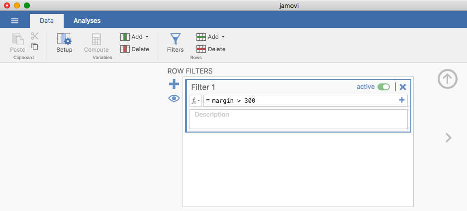
Fig. 28 The jamovi filter screen
This filter creates a new column in the spreadsheet view where only those
observations that pass the filter are included. One neat way to quickly
identify which observations these are is to tell jamovi to produce a
Frequency table (in the Exploration → Descriptives window) for the
ID variable (which must be a nominal variable  otherwise the
Frequency table is not produced). In Fig. 29 you can see that the
ID values for the observations where the margin was over 300 are 14 and
134. These are suspicious cases, or observations, where you should go back
to the original data source to find out what is going on.
otherwise the
Frequency table is not produced). In Fig. 29 you can see that the
ID values for the observations where the margin was over 300 are 14 and
134. These are suspicious cases, or observations, where you should go back
to the original data source to find out what is going on.

Fig. 29 Frequency table for ID showing the ID numbers for the two suspicious outliers: 14 and 134
Usually you find that someone has just typed in the wrong number. Whilst this might seem like a silly example, I should stress that this kind of thing actually happens a lot. Real world data sets are often riddled with stupid errors, especially when someone had to type something into a computer at some point. In fact, there’s actually a name for this phase of data analysis and in practice it can take up a huge chunk of our time: data cleaning. It involves searching for typing mistakes (“typos”), missing data and all sorts of other obnoxious errors in raw data files.
For less extreme values, even if they are flagged in a a box plot as outliers, the decision about whether to include outliers or exclude them in any analysis depends heavily on why you think the data look they way they do and what you want to use the data for. You really need to exercise good judgement here. If the outlier looks legitimate to you, then keep it. In any case, I’ll return to the topic again in section Model checking.