Autore della sezione: Danielle J. Navarro and David R. Foxcroft
Model checking
The main focus of this section is regression diagnostics, a term that refers to the art of checking that the assumptions of your regression model have been met, figuring out how to fix the model if the assumptions are violated, and generally to check that nothing “funny” is going on. I refer to this as the “art” of model checking with good reason. It is not easy, and while there are a lot of fairly standardised tools that you can use to diagnose and maybe even cure the problems that ail your model (if there are any, that is!), you really do need to exercise a certain amount of judgement when doing this.
In this section I describe several different things you can do to check that
your regression model is doing what it is supposed to. It does not cover the
full space of things you could do, but it is still much more detailed than what
a lot of people are doing in practice. It is easy to get lost in all the
details of checking this thing or that thing, and it is quite exhausting to try
to remember what all the different things are. This has the very nasty side
effect that a lot of people get frustrated when trying to learn all the
tools, so instead they decide not to do any model checking. Therefore, it is
important that you get a sense of what tools are at your disposal, so I will
try to introduce a bunch of them here. I should note that this section draws
quite heavily from Fox and Weisberg (2011), the book
associated with the car package that is used to conduct regression analysis
in R. The car package is notable for providing some excellent tools for
regression diagnostics, and the book itself talks about them in an admirably
clear fashion. I do not want to sound too gushy about it, but I do think that
Fox and Weisberg (2011) is well worth reading, even if some
of the more advanced diagnostic techniques are only available in R (e.g.,
using the Rj editor).
Three kinds of residuals
The majority of regression diagnostics revolve around looking at the residuals, and by now you have probably formed a sufficiently pessimistic theory of statistics to be able to guess that, precisely because of the fact that we care a lot about the residuals, there are several different kinds of residual that we might consider. In particular, the following three kinds of residuals are referred to in this section: “ordinary residuals”, “standardised residuals”, and “Studentised residuals”. There is a fourth kind that you will see referred to in some of the Figures, and that is the “Pearson residual”. However, for the models that we are talking about in this chapter, the Pearson residual is identical to the ordinary residual.
The first and simplest kind of residuals that we care about are ordinary residuals. These are the actual raw residuals that I have been talking about throughout this chapter so far. The ordinary residual is just the difference between the fitted value Ŷi and the observed value Yi. I have been using the notation εi to refer to the i-th ordinary residual, and by gum I am going to stick to it. With this in mind, we have the very simple equation:
This is of course what we saw earlier, and unless I specifically refer to some other kind of residual, this is the one I am talking about. So there is nothing new here. I just wanted to repeat myself. One drawback to using ordinary residuals is that they are always on a different scale, depending on what the outcome variable is and how good the regression model is. That is, unless you have decided to run a regression model without an intercept term, the ordinary residuals will have mean 0 but the variance is different for every regression. In a lot of contexts, especially where you are only interested in the pattern of the residuals and not their actual values, it is convenient to estimate the standardised residuals, which are normalised in such a way as to have standard deviation 1.
The way we calculate these is to divide the ordinary residual by an estimate of the (population) standard deviation of these residuals. For technical reasons, mumble mumble, the formula for this is:
\(\hat\sigma\) is the estimated population standard deviation of the ordinary residuals, and hi is the “hat value” of the i-th observation. I have not explained hat values to you yet (but have no fear,[1] it is coming shortly), so this will not make a lot of sense. For now, it is enough to interpret the standardised residuals as if we would converted the ordinary residuals to z-scores. In fact, that is more or less the truth, it is just that we are being a bit fancier.
The third kind of residuals are Studentised residuals (also called “jackknifed residuals”) and they are even fancier than standardised residuals. Again, the idea is to take the ordinary residual and divide it by some quantity in order to estimate some standardised notion of the residual.
The formula for doing the calculations this time is subtly different:
Notice that our estimate of the standard deviation here is written \(\hat{\sigma}_{(-i)}\). What this corresponds to is the estimate of the residual standard deviation that you would have obtained if you just deleted the ith observation from the data set. This sounds like the sort of thing that would be a nightmare to calculate, since it seems to be saying that you have to run N new regression models (even a modern computer might grumble a bit at that, especially if you have got a large data set). Fortunately, some terribly clever person has shown that this standard deviation estimate is actually given by the following equation:
Before moving on, I should point out that you do not often need to obtain these residuals yourself, even though they are at the heart of almost all regression diagnostics. Most of the time the various options that provide the diagnostics, or assumption checks, will take care of these calculations for you. Even so, it is always nice to know how to actually get hold of these things yourself in case you ever need to do something non-standard.
Checking the linearity of the relationship
We should check for the linearity of the relationships between the predictors and the outcomes. There is a few different things that you might want to do in order to check this. Firstly, it never hurts to just plot the relationship between the predicted values Ŷi and the observed value Yi for the outcome variable, as illustrated in Fig. 140. To draw this in jamovi, we saved the predicted values to the data set, and then drew a scatterplot of the observed against the predicted (fitted) values. This gives you a kind of “big picture view” – if this plot looks approximately linear, then we are probably not doing too badly (though that is not to say that there are not problems). However, if you can see big departures from linearity here, then it strongly suggests that you need to make some changes.

Fig. 140 jamovi plot of the predicted values against the observed values of the outcome variable. A straight(-ish) line is what we are hoping to see here. This looks pretty good, suggesting that there is nothing grossly wrong.
In any case, in order to get a more detailed picture it is often more informative to look at the relationship between the predicted values and the residuals themselves. Again, in jamovi you can save the residuals to the data set and then draw a scatterplot of the predicted values against the residual values, as in Fig. 141. As you can see, not only does it draw the scatterplot showing the predicted value against the residuals, you can also plot a line through the data that shows the relationship between the two. Ideally, this should be a straight, perfectly horizontal line. In practice, we are looking for a reasonably straight or flat line. This is a matter of judgement.

Fig. 141 jamovi plot of the predicted values against the residuals, with a line showing the relationship between the two. If this is horizontal and straight(-ish), then we can feel reasonably confident that the “average residual” for all “predicted values” is more or less the same.
More advanced versions of the same plot are produced by checking Residuals
plots in the Assumption Checks options of the regression analysis in
jamovi. These are useful for checking linearity, normality and equality of
variance assumptions, and we look at these in more detail in the next section.
This option not only draws plots comparing the predicted values to the
residuals, it does so for each individual predictor.
Checking the normality of the residuals
Like many of the statistical tools we have discussed in this book, regression
models rely on a normality assumption. In this case, we assume that the
residuals are normally distributed. The first thing we can do is draw a QQ-plot
via the Assumption Checks → Q-Q plot of residuals option. The output is
shown in Fig. 142, showing the standardised residuals plotted as a
function of their theoretical quantiles according to the regression model.
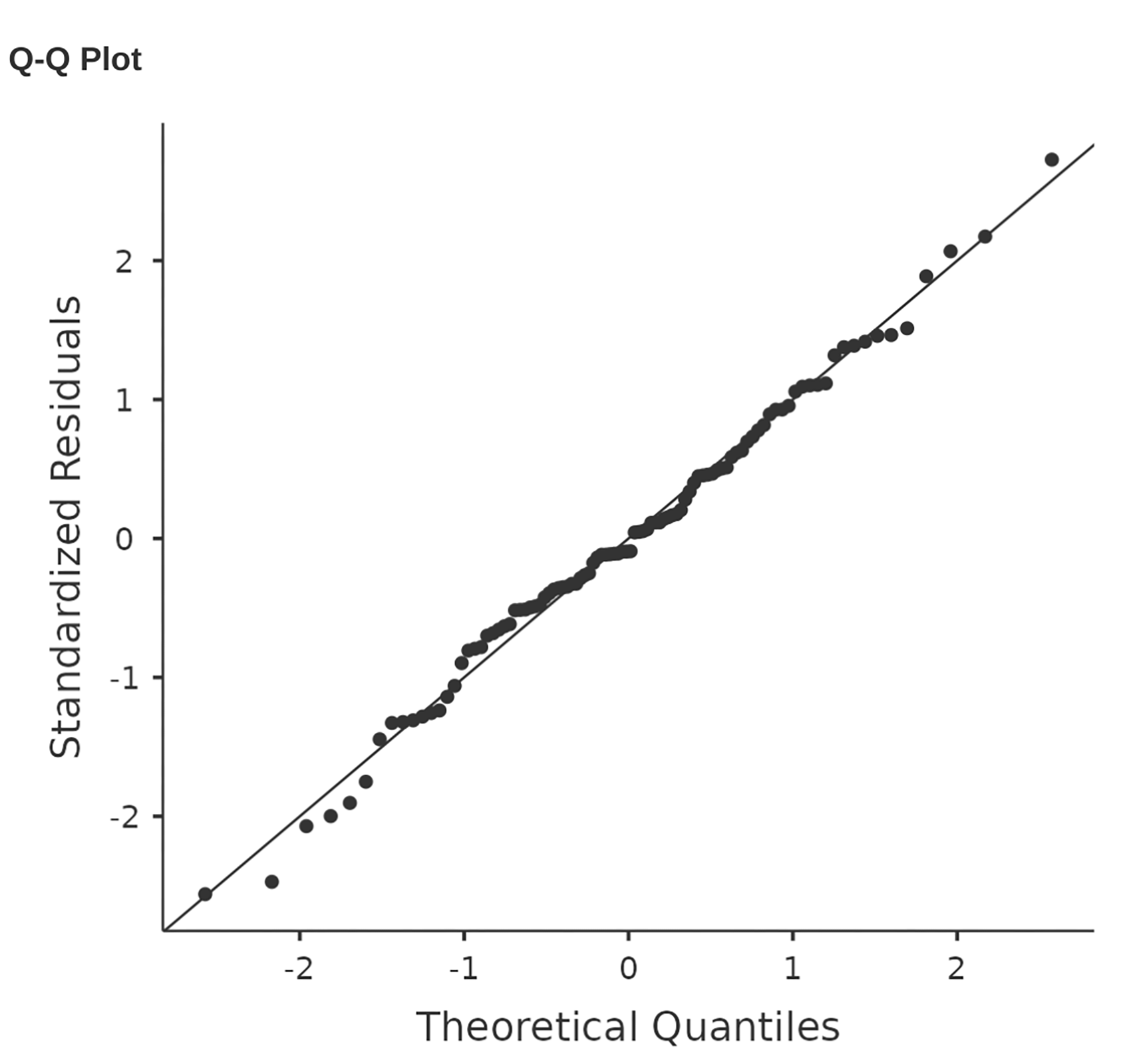
Fig. 142 Plot of the theoretical quantiles according to the model, against the quantiles of the standardised residuals, produced in jamovi
Another thing we should check is the relationship between the fitted values and
the residuals themselves. We can get jamovi to do this using the Residuals
Plots option, which provides a scatterplot for each predictor variable, the
outcome variable, and the fitted values against residuals, see
Fig. 143. In these plots we are looking for a fairly uniform
distribution of “dots”, with no clear bunching or patterning of the “dots”.
Looking at these plots, there is nothing particularly worrying as the dots are
fairly evenly spread across the whole plot. There may be a little bit of
non-uniformity in the right panel, but it is not a strong deviation and
probably not worth worrying about.

|

|

|

|

Fig. 143 Residuals plots produced in jamovi
If we were worried, then in a lot of cases the solution to this problem (and many others) is to transform one or more of the variables. We discussed the basics of variable transformation in the sections Transforming variables and Mathematical functions and operations, but I do want to make special note of one additional possibility that I did not explain fully earlier: the Box-Cox transform.
The Box-Cox function is a fairly simple one and it is very widely used.
for all values of λ except λ = 0. When λ = 0 we just take the natural logarithm (i.e., ln(x)).
You can calculate it using the BOXCOX function in the Compute variables
screen in jamovi.
Checking equality of variance
The regression models that we have talked about all make an equality (i.e., homogeneity) of variance assumption: the variance of the residuals is assumed to be constant. To plot this in jamovi first we need to calculate the square root of the (absolute) size of the residual,[2] and then plot this against the predicted values, as in Fig. 144. Note that this plot actually uses the standardised residuals rather than the raw ones, but it is immaterial from our point of view. What we are looking to see here is a straight, horizontal line running through the middle of the plot.[3]

Fig. 144 jamovi plot of the predicted values (model predictions) against the square root of the absolute standardised residuals. This plot is used to diagnose violations of homogeneity of variance. If the variance is really constant, then the line through the middle should be horizontal and flat(-ish).
Checking for collinearity
The last kind of regression diagnostic that I am going to discuss in this chapter is the use of variance inflation factors (VIF*s), which are useful for determining whether or not the predictors in your regression model are too highly correlated with each other. There is a variance inflation factor associated with each predictor *Xk in the model.
The formula for the k-th VIF is:
Here, R²(-k) refers to R-squared value you would get if you ran a regression using Xk as the outcome variable, and all the other X variables as the predictors. The idea here is that R²(-k) is a very good measure of the extent to which Xk is correlated with all the other variables in the model.
The square root of the VIF is pretty interpretable. It tells you how much wider the confidence interval for the corresponding coefficient bk is, relative to what you would have expected if the predictors are all nice and uncorrelated with one another.
If you have only got two predictors, the VIF values are always going to be
the same, as we can see if we click on the Collinearity checkbox in the
Regression → Assumption Checks options in jamovi. For both
dani.sleep and baby.sleep the VIF is 1.65. And since the square root
of 1.65 is 1.28, we see that the correlation between our two predictors is not
causing much of a problem.
To give a sense of how we could end up with a model that has bigger
collinearity problems, suppose I were to run a much less interesting regression
model, in which I tried to predict the day on which the data were
collected, as a function of all the other variables in the data set. To see why
this would be a bit of a problem, let us have a look at the correlation matrix
for all four variables (Fig. 145).
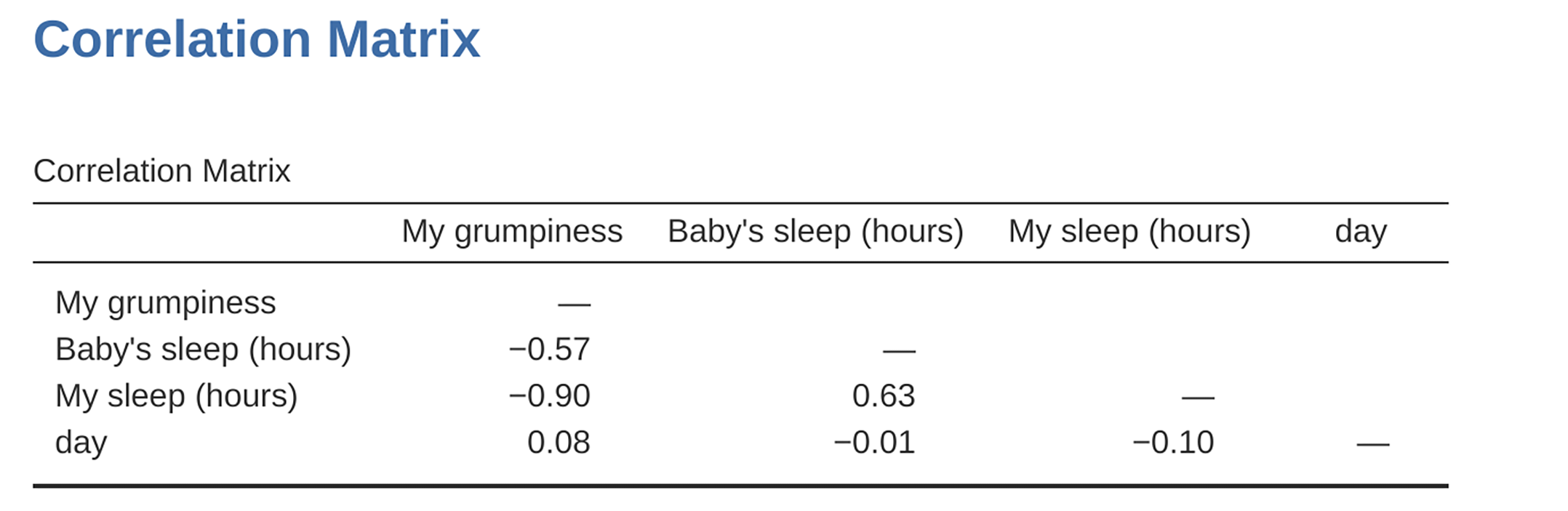
Fig. 145 Correlation matrix in jamovi for all four variables
We have some fairly large correlations between some of our predictor variables! When we run the regression model and look at the VIF values, we see that the collinearity is causing a lot of uncertainty about the coefficients. First, run the regression, as in Fig. 146 and you can see from the VIF values that, yep, that is some mighty fine collinearity there.
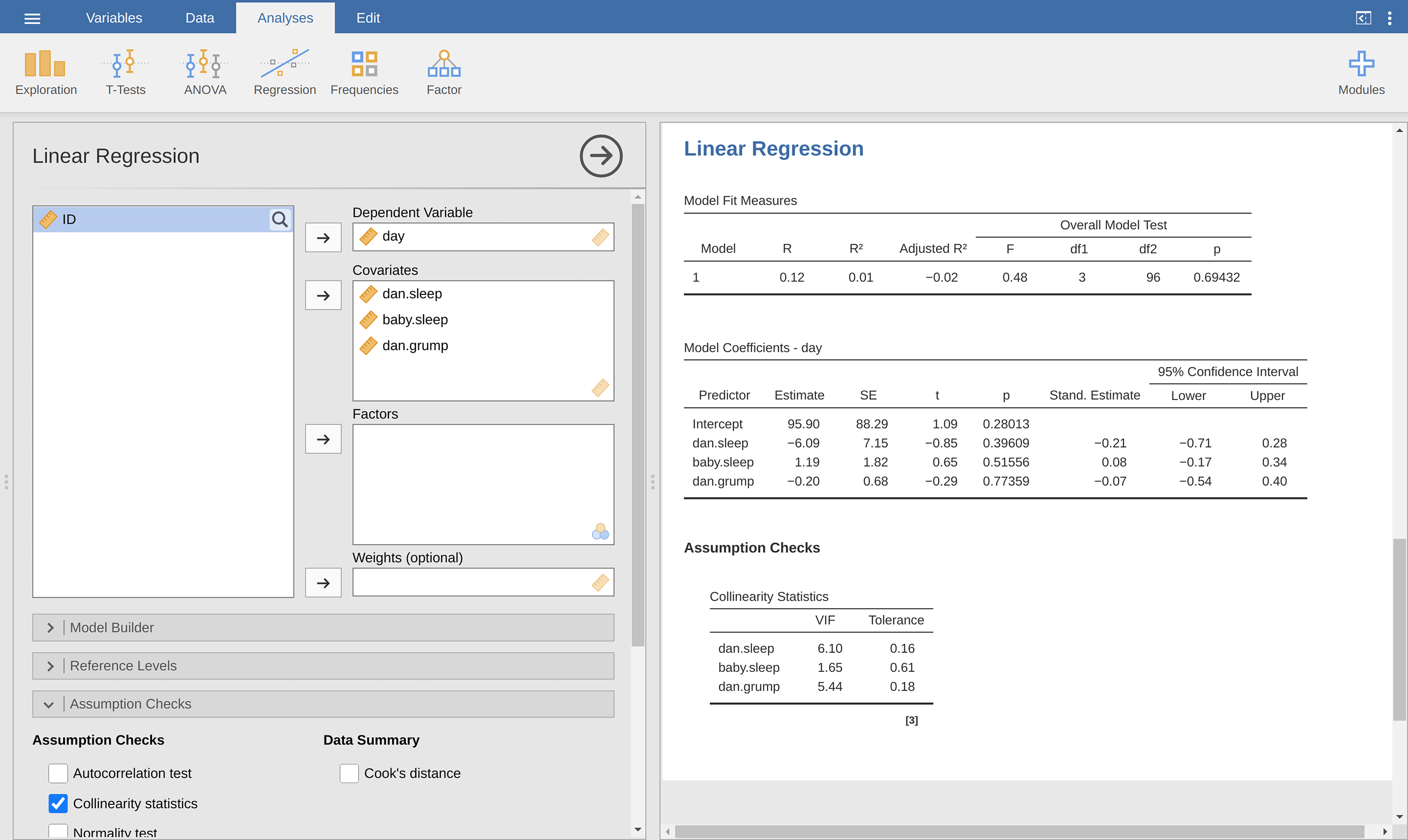
Fig. 146 Collinearity statistics for multiple regression, produced in jamovi
Outliers and anomalous data
One danger that you can run into with linear regression models is that your
analysis might be disproportionately sensitive to a smallish number of
“unusual” or “anomalous” observations. I discussed this idea previously in
subsection Using box plots to detect outliers
in the context of discussing the outliers that get automatically identified by
the Box plot option under Exploration → Descriptives, but this time
we need to be much more precise. In the context of linear regression, there are
three conceptually distinct ways in which an observation might be called
“anomalous”. All three are interesting, but they have rather different
implications for your analysis.
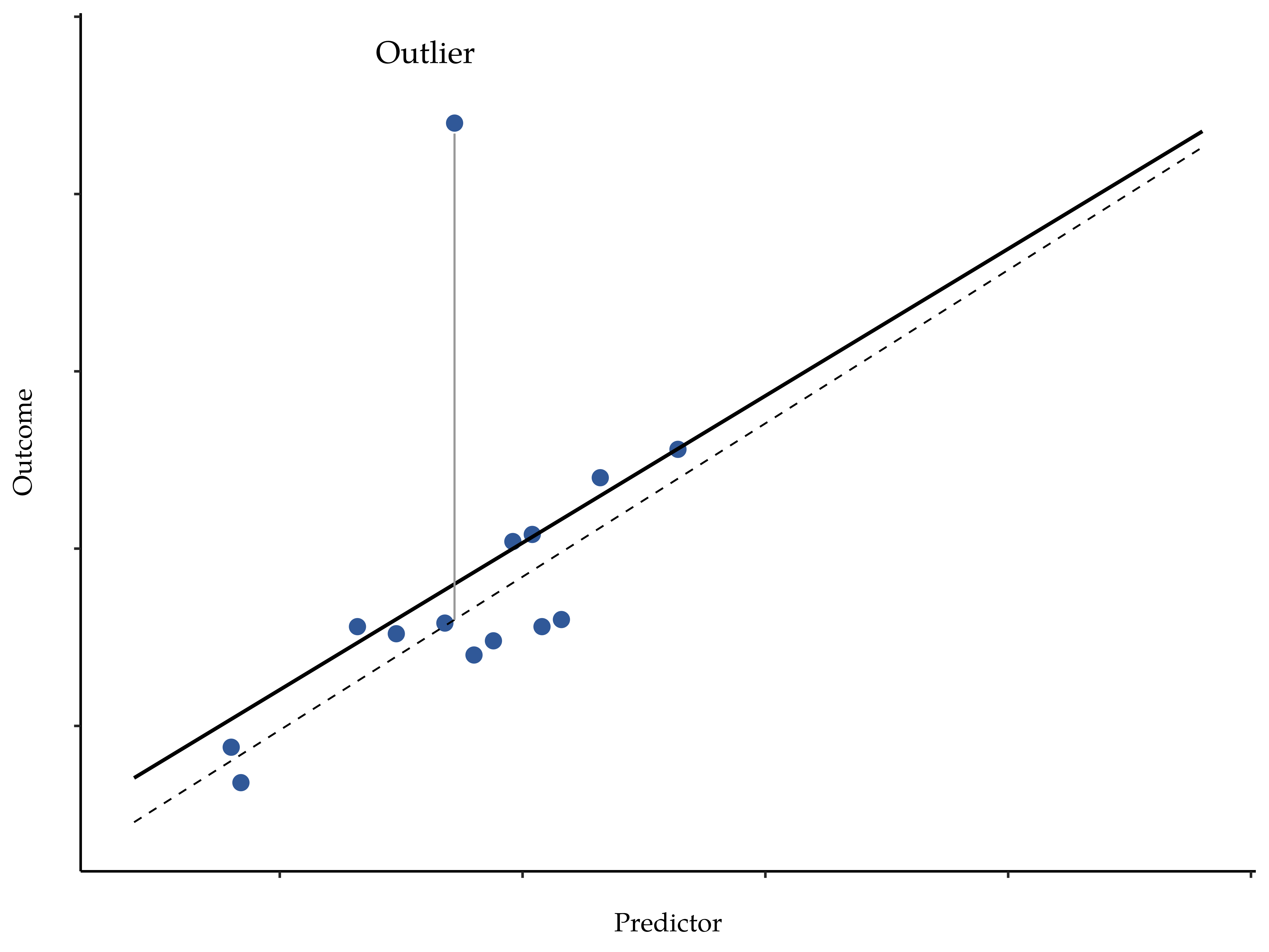
Fig. 147 An illustration of outliers: The solid line shows the regression line with the anomalous outlier observation included. The dashed line plots the regression line estimated without the anomalous outlier observation included. The vertical line from the outlier point to the dashed regression line illustrates the large residual error for the outlier.
The first kind of unusual observation is an outlier. The definition of an outlier (in this context) is an observation that is very different from what the regression model predicts. An example is shown in Fig. 147. In practice, we operationalise this concept by saying that an outlier is an observation that has a very large Studentised residual, εi*. Outliers are interesting: a big outlier might correspond to junk data, e.g., the variables might have been recorded incorrectly in the data set, or some other defect may be detectable. Note that you should not throw an observation away just because it is an outlier. But the fact that it is an outlier is often a cue to look more closely at that case and try to find out why it is so different. Also see the lower left plot of Anscombe’s quartet, Fig. 129.
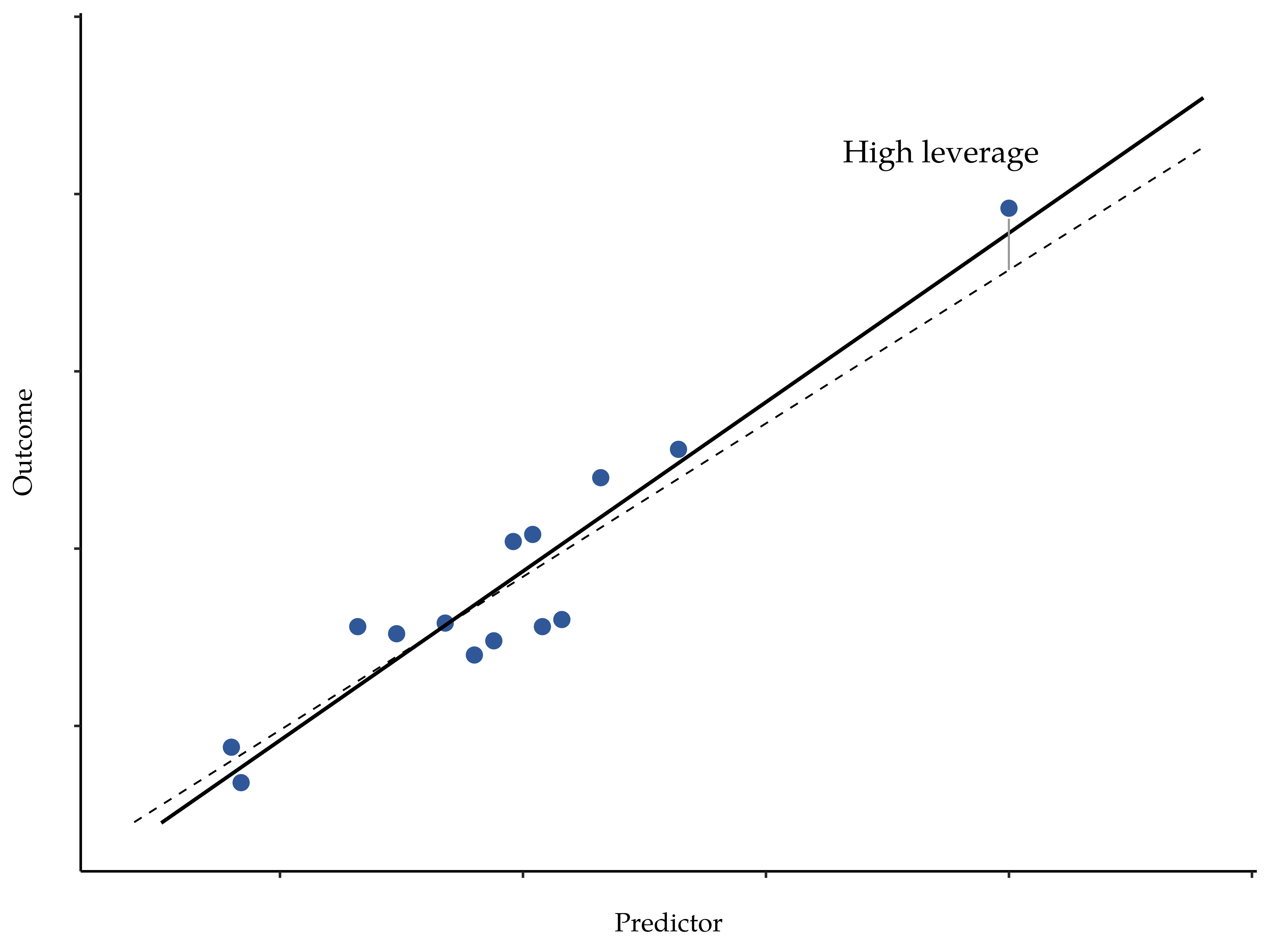
Fig. 148 An illustration of high leverage points: The anomalous observation in this case is unusual both in terms of the predictor (x-axis) and the outcome (y-axis), but this unusualness is highly consistent with the pattern of correlations that exists among the other observations. The observation falls very close to the regression line and does not distort it by very much.
The second way in which an observation can be unusual is if it has high leverage, which happens when the observation is very different from all the other observations. This does not necessarily have to correspond to a large residual. If the observation happens to be unusual on all variables in precisely the same way, it can actually lie very close to the regression line. An example of this is shown in Fig. 148. The leverage of an observation is operationalised in terms of its hat value, usually written hi. The formula for the hat value is rather complicated,[4] but it interpretation is not: hi is a measure of the extent to which the i-th observation is “in control” of where the regression line ends up going.
In general, if an observation lies far away from the other ones in terms of the predictor variables, it will have a large hat value (as a rough guide, high leverage is when the hat value is more than two to three times the average; and note that the sum of the hat values is constrained to be equal to K + 1). High leverage points are also worth looking at in more detail, but they are much less likely to be a cause for concern unless they are also outliers.
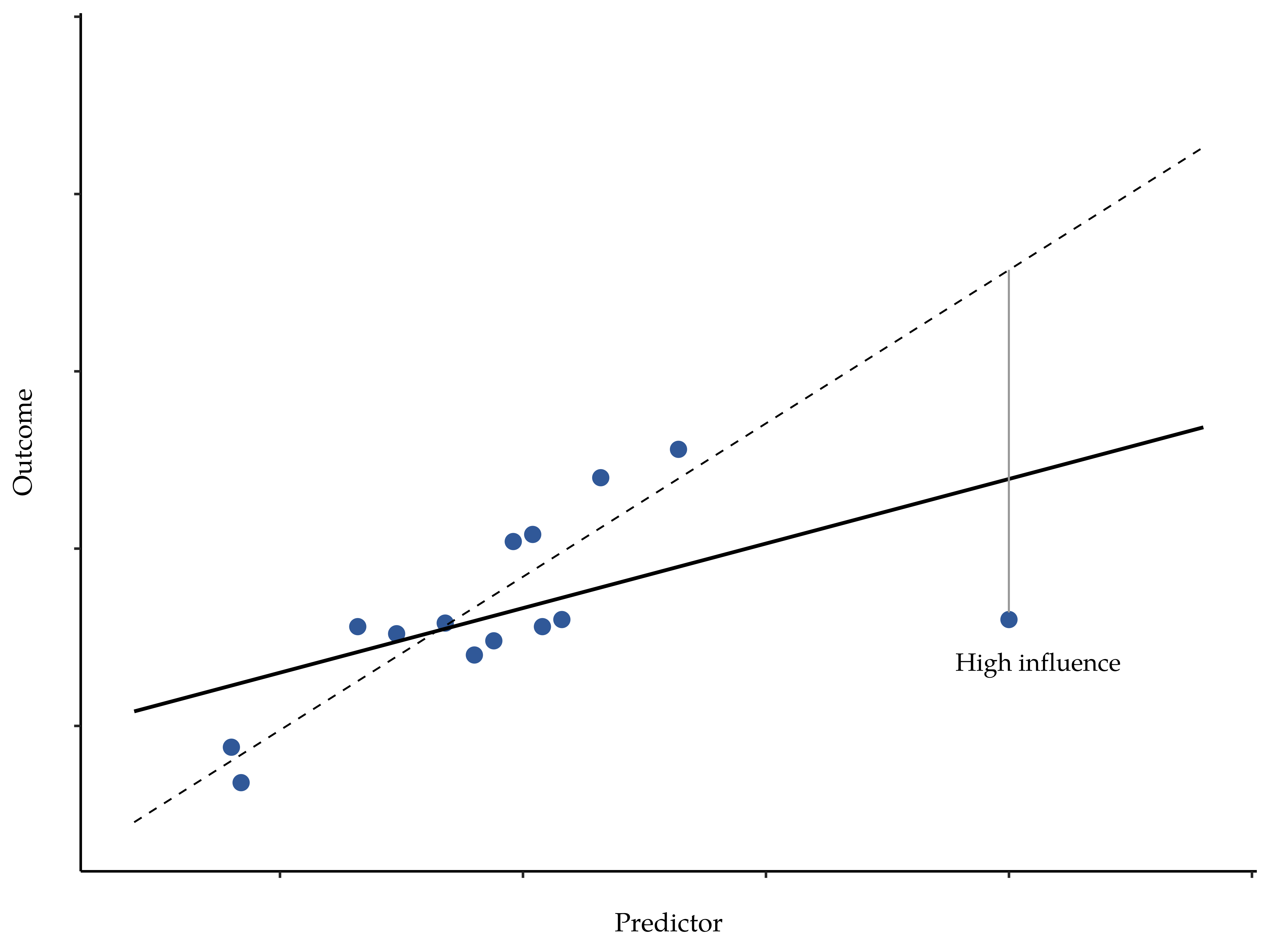
Fig. 149 Illustration of high influence points: In this case, the anomalous observation is highly unusual on the predictor variable (x-axis), and falls a long way from the regression line. As a consequence, the regression line is highly distorted, even though (in this case) the anomalous observation is entirely typical in terms of the outcome variable (y-axis).
This brings us to our third measure of unusualness, the influence of an observation. A high influence observation is an outlier that has high leverage. That is, it is an observation that is very different to all the other ones in some respect, and also lies a long way from the regression line. This is illustrated in Fig. 149. Notice the contrast to the previous two figures. Outliers do not move the regression line much and neither do high leverage points. But something that is both an outlier and has high leverage, well that has a big effect on the regression line. That is why we call these points high influence, and it is why they are the biggest worry.
We operationalise influence in terms of a measure known as Cook’s distance.
Notice that this is a multiplication of something that measures the outlier-ness of the observation (the bit on the left), and something that measures the leverage of the observation (the bit on the right).
In order to have a large Cook’s distance an observation must be a fairly substantial outlier and have high leverage. As a rough guide, Cook’s distance greater than 1 is often considered large (that is what I typically use as a quick and dirty rule).
In jamovi, information about Cook’s distance can be calculated by clicking on
the Cook’s Distance checkbox in the Assumption Checks → Data
Summary options. When you do this, for the multiple regression model we have
been using as an example in this chapter, you get the results as shown in
Fig. 150.
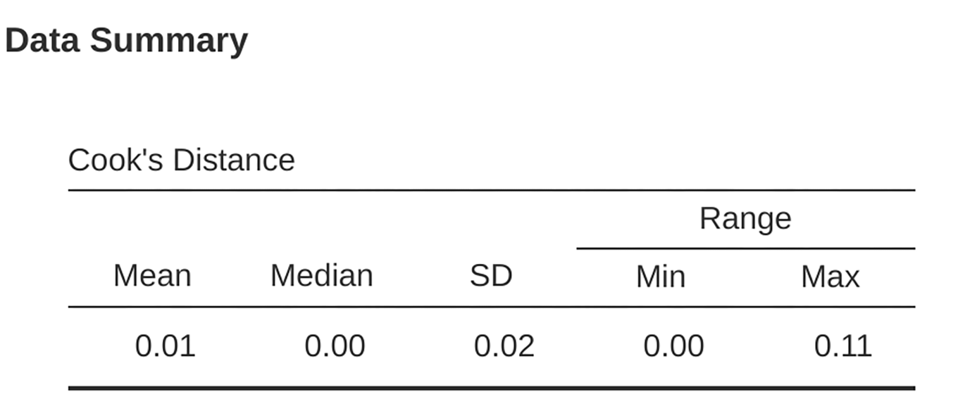
Fig. 150 jamovi output showing the table for the Cook’s distance statistics
You can see that, in this example, the mean Cook’s distance value is 0.01, and the range is from 0.00 to 0.11, so this is some way off the rule of thumb figure mentioned above that a Cook’s distance greater than 1 is considered large.
An obvious question to ask next is, if you do have large values of Cook’s distance what should you do? As always, there is no hard and fast rule. Probably the first thing to do is to try running the regression with the outlier with the greatest Cook’s distance[5] excluded and see what happens to the model performance and to the regression coefficients. If they really are substantially different, it is time to start digging into your data set and your notes that you no doubt were scribbling as your ran your study. Try to figure out why the point is so different. If you start to become convinced that this one data point is badly distorting your results then you might consider excluding it, but that is less than ideal unless you have a solid explanation for why this particular case is qualitatively different from the others and therefore deserves to be handled separately.