Autore della sezione: Danielle J. Navarro and David R. Foxcroft
Scatterplots
Scatterplots are a simple but effective tool for visualising the
relationship between two variables, like we saw with the figures in the
section on correlation (section Correlations). It is this latter
application that we usually have in mind when we use the term “scatterplot”.
In this kind of plot each observation corresponds to one dot. The horizontal
location of the dot plots the value of the observation on one variable, and
the vertical location displays its value on the other variable. In many
situations you do not really have a clear opinions about what the causal
relationship is (e.g., does A cause B, or does B cause A, or does some other
variable C control both A and B). If that is the case, it does not really
matter which variable you plot on the x-axis and which one you plot on the
y-axis. However, in many situations you do have a pretty strong idea which
variable you think is most likely to be causal, or at least you have some
suspicions in that direction. If so, then it is conventional to plot the cause
variable on the x-axis, and the effect variable on the y-axis. With that in
mind, let us look at how to draw scatterplots in jamovi, using the same
parenthood data set that I used when introducing correlations.
Suppose my goal is to draw a scatterplot displaying the relationship between
the amount of sleep that I get (dani.sleep) and how grumpy I am the next
day (dani.grump). There are two different ways in which we can use jamovi
to get the plot that we are after. The first way is to use the Plot option
under the Regression → Correlation Matrix button, giving us the output
shown in Fig. 131. Note that jamovi draws a line through the
points, we will come onto this a bit later in section What is a linear regression model?.
Plotting a scatterplot in this way also allow you to specify Densities for
variables and this option adds a density curve showing how the data in each
variable is distributed.
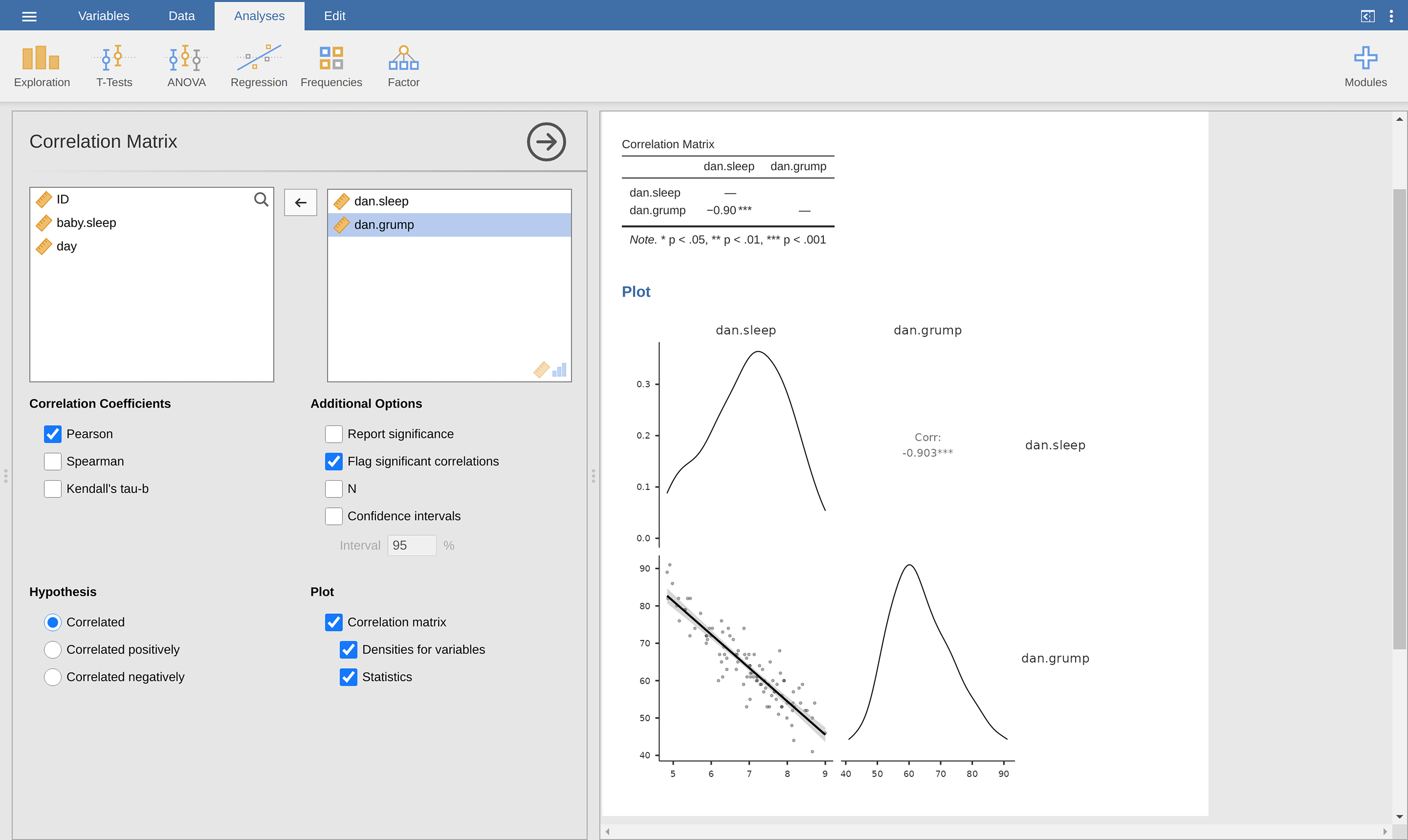
Fig. 131 Scatterplot created with the Correlation Matrix analysis in jamovi
The second way do to it is to use the Exploration → Scatterplot
function. This plot is a bit different than the first way, see
Fig. 132, but the important information is the same.
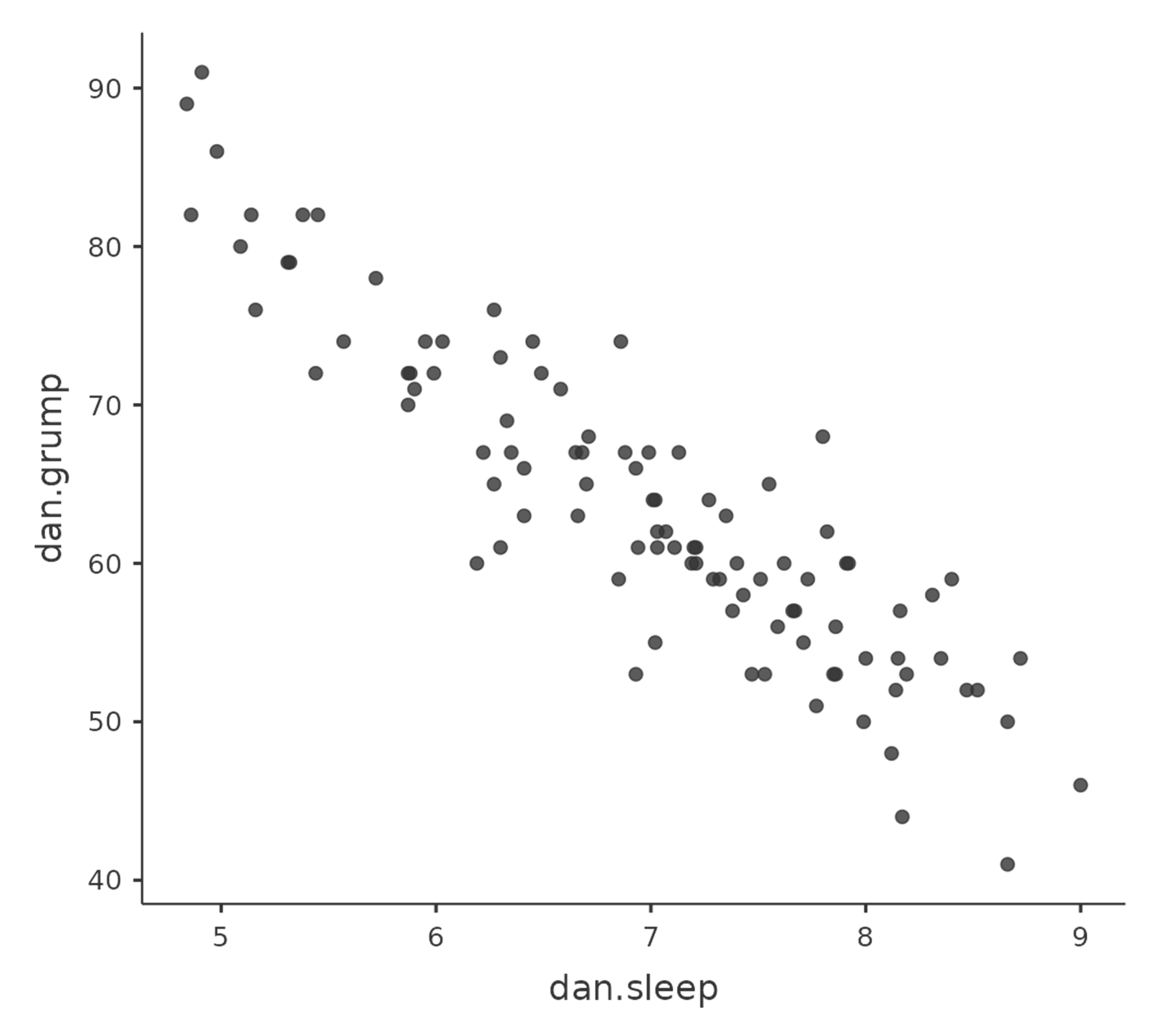
Fig. 132 Scatterplot cretaed with the scatr add-on module in jamovi
More elaborate options
Often you will want to look at the relationships between several variables at
once, using a scatterplot matrix (in jamovi via the Correlation Matrix
→ Plot command). Just add another variable, for example baby.sleep to
the list of variables to be correlated, and jamovi will create a scatterplot
matrix for you, just like the one in Fig. 133.
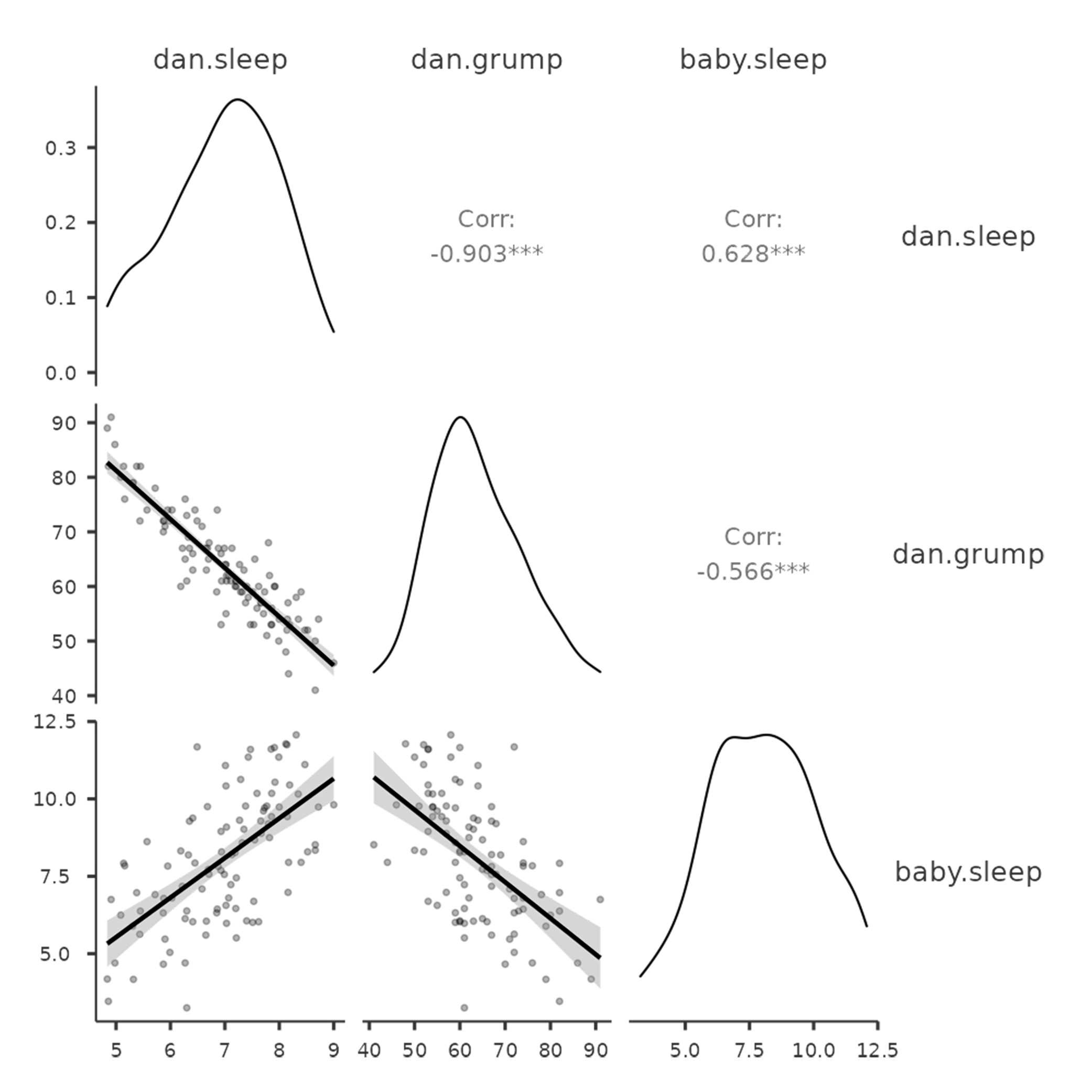
Fig. 133 Matrix of scatterplots cretaed with the Correlation Matrix analysis
in jamovi.