Afsnitsforfatter: Danielle J. Navarro and David R. Foxcroft
Bar graphs
Another form of graph that you often want to plot is the bar graph. Let us
use the afl.finalists data set with the afl.finalists variable that I
introduced in Mode. What I want to do is draw a bar graph that
displays the number of finals that each team has played in over the time
spanned by the afl.finalists data set. There are lots of teams, but I am
particularly interested in just four: Brisbane, Carlton, Fremantle and
Richmond. So the first step is to set up a filter so just those four teams are
included in the bar graph. This is straightforward in jamovi and you can do it
by using the Filters function that we used previously. Open up the
Filters screen and type in the following exactly as written – including
the single quote marks:[1]
afl.finalists == "Brisbane" or afl.finalists == "Carlton" or
afl.finalists == "Fremantle" or afl.finalists == "Richmond"
When you have done this you will see, in the Data view, that jamovi has
filtered out all values apart from those we have specified. Next, open up the
Exploration → Descriptives window and click on the Bar plot check
box (remember to move the afl.finalists variable across into the
Variables box so that jamovi knows which variable to use). You should then
get a bar graph, something like that shown in figur 31.
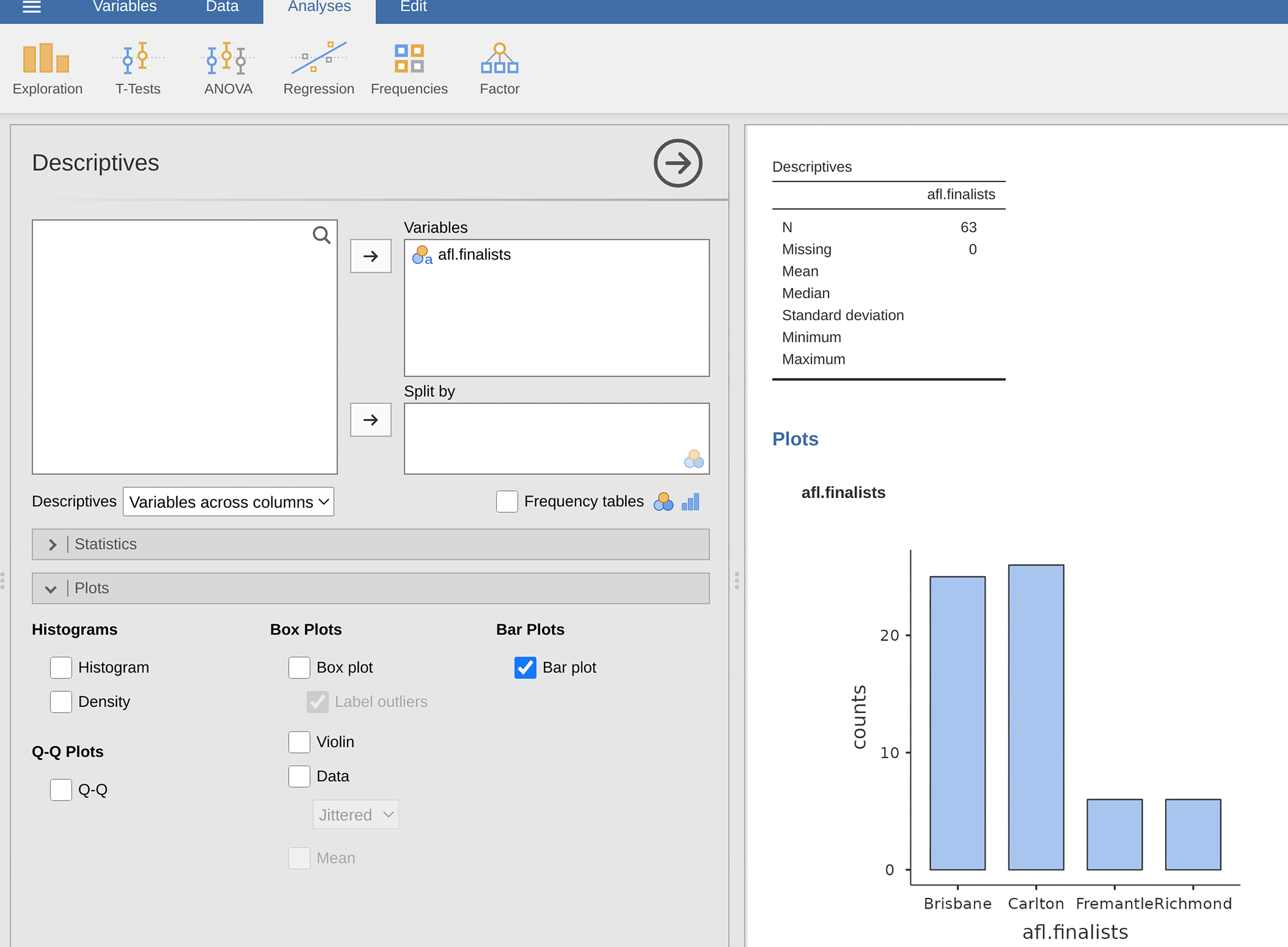
figur 31 Filtering to include just four AFL teams, and drawing a bar plot in jamovi